All work
Portfolio website 2025–2026
Portfolio Design & Build
A rebuild of my original portfolio in Astro, with Markdown-backed case studies, responsive project layouts, accessible navigation, and dedicated CV and dissertation pages.
Brief
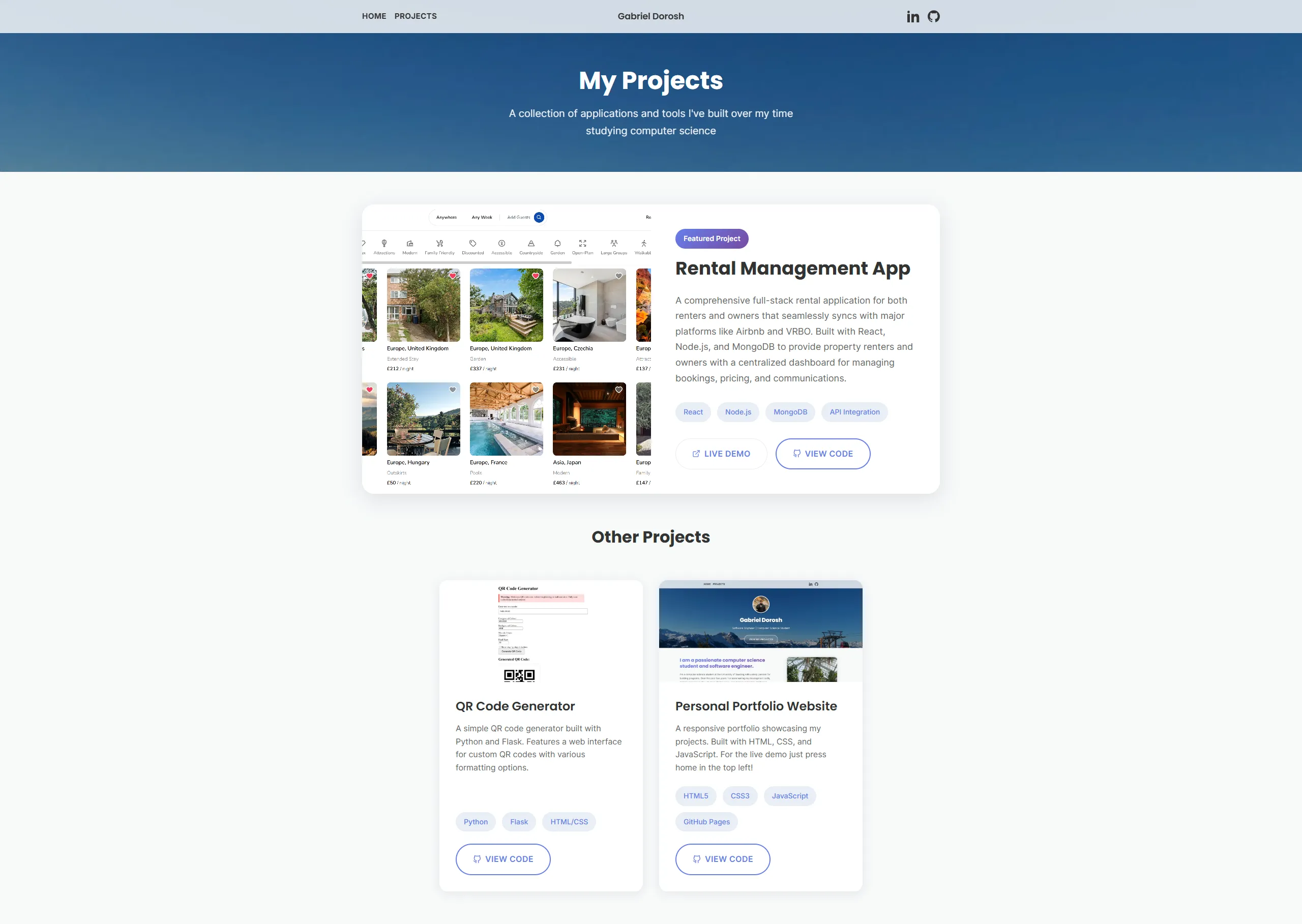
- Before state: The original site had a recognisable mountain hero and plenty of personality, but its project cards offered little room to explain decisions and long images could dominate the page.
- Audience: The redesign needs to work for employers reviewing projects quickly, collaborators looking for technical context, and visitors who want to know the person behind the work.
- First impression: Within the first screen, a visitor should understand who I am, what I build, and where to explore the evidence.
- Core problem: The site needed a clearer project hierarchy without losing the travel photography, personal links, and hidden details that made it feel like mine.
Design goals
- Keep: I retained the mountain hero, travel photography, personal links, and hidden Gaming page from the original portfolio.
- Improve: The redesign prioritises clearer hierarchy, bounded media, restrained motion, and case studies that explain the work rather than only displaying it.
- Balance: Professional projects lead the experience, while personal material adds context without competing for attention.
Information architecture
- Top-level routes: Home introduces the portfolio, Work supports quick project comparison, About adds personal context, and CV provides a dedicated document view.
- Project depth: Individual case studies give each project room for its problem, decisions, implementation, evidence, and limitations.
- Documents: The CV and degree report have dedicated preview and download pages so visitors can inspect them without leaving the site immediately.
- Discovery: Selected work on the home page leads into the full project index, while next-case-study links encourage continued exploration.
Visual system
- Typography: Poppins carries display headings while Inter keeps longer body copy and metadata readable.
- Colour: A warm paper background and dark ink create the shared foundation, with a distinct accent colour identifying each project.
- Media rules: Responsive images, capped heights, intentional
object-fitvalues, and phone mockups prevent screenshots from overwhelming the layout. - Motifs: Overlapping polaroids preserve the personal photography of the original site, while rules and compact project rows create a more editorial rhythm.
- Consistency: Shared Astro components and CSS variables keep headings, cards, buttons, metadata, and spacing aligned across routes.
Responsive decisions
- Project index: Desktop uses a compact list with a sticky preview, tablet uses alternating editorial rows, and mobile stacks each project into a direct card.
- Navigation: The desktop header keeps core links and social profiles visible, while the mobile menu provides the same routes in a touch-friendly layout.
- Case studies: Media remains bounded, metadata reflows cleanly, and action buttons wrap without dominating narrow screens.
- Photography: Portrait crops and polaroid interactions adapt to the available width without sending images off-screen.
Interaction and accessibility
- Header behaviour: On desktop, my name appears after the home hero; on mobile, it remains visible in the navbar.
- Hidden route: Gaming retains its orange hover treatment on desktop and can be discovered through a deliberate long press on mobile.
- Keyboard: The menu traps focus while open, Escape closes it, and focus states remain visible across navigation and interactive cards.
- Structure: Semantic landmarks, ordered headings, descriptive alt text, and a skip link support assistive technology.
- Motion: Reveal and polaroid movement is deliberately restrained and disabled when the visitor requests reduced motion.
Iteration
- Restoration: The mountain background was restored after an early redesign removed too much of the original site’s identity.
- Scale: Page titles, whitespace, and media heights were reduced so content appears sooner and case studies remain scannable.
- Interaction: Polaroid rotation was corrected, movement was softened, and the hidden Gaming navigation was refined.
- Layouts: The Work page now adapts to each breakpoint, and the next-case-study treatment is more compact.
Outcome and reflection
- Delivered structure: The finished site has dedicated Home, Work, About, CV, dissertation report, and project case-study routes.
- Maintainability: Astro Content Collections centralise project metadata and Markdown bodies, making future case studies primarily a content task.
- Learning: The rebuild made content structure, responsive behaviour, accessibility, and deployment part of the implementation rather than final polish.
- Future growth: The shared components and media rules provide room for new projects without another structural redesign.
Project evidence
The original portfolio, before the redesign
Full-page reference captures of the previous home and projects pages on desktop and mobile.
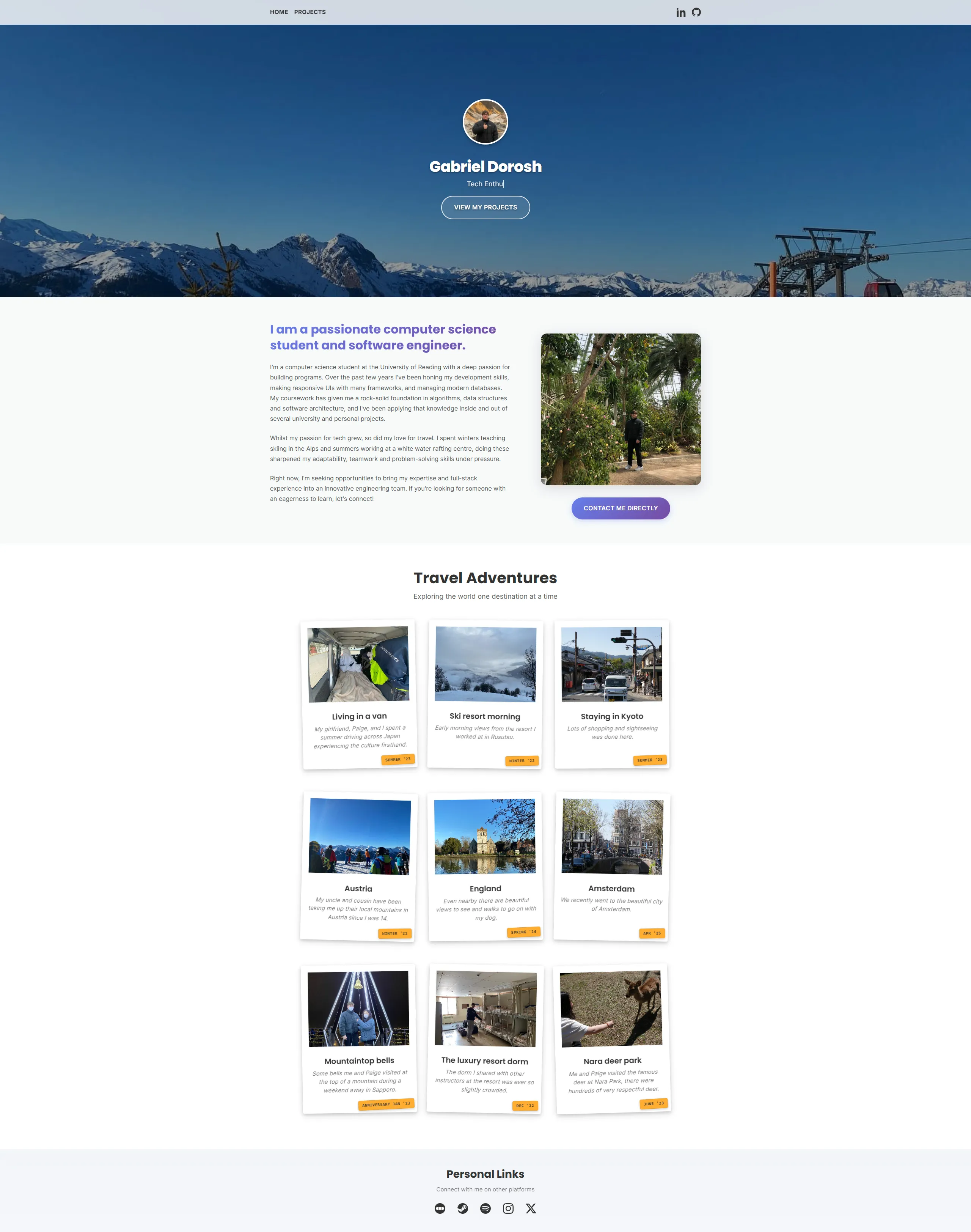
Original home · desktopHero, biography, travel gallery, and personal links before the redesign.
View full captureOriginal projects · desktopFeatured-project and card-grid presentation before detailed case studies were added.
View full capture
Original home · mobileThe previous single-column home experience and full travel-card sequence.
View full capture
Original projects · mobileThe previous stacked project-card layout on a narrow screen.
View full capture